Your email list is the one audience no algorithm can take away. But it only grows if people actually fill in your signup form.
And most don't. The typical form sits at the bottom of the page, says "Subscribe to our newsletter," and gets ignored.
The good news is that a few simple changes can make a big difference. Better words, better placement and better timing often turn the same traffic into many more subscribers.
Here are 10 newsletter signup form best practices you can apply this week, plus a simple way to test what works on your own site.
Why Your Signup Form Matters So Much
Social media reach goes up and down. Search rankings change. But an email lands in your subscriber's inbox every time you send it.
That makes your signup form one of the most valuable parts of your website. Every visitor who leaves without subscribing is someone you may never reach again. Every visitor who subscribes is someone you can help, and sell to, for years.
Small gains add up fast, and you don't need more traffic to see them. If 1,000 people visit your site each week and your form converts 1% of them, you get 10 new subscribers a week. Get that to 3% and you get 30, which is over 1,500 a year from the same traffic.
Anatomy of a Signup Form That Converts
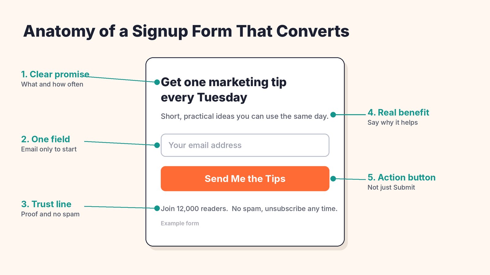
A great form has five simple parts. A clear promise, a short line on why it helps, as few fields as possible, a specific button and a small trust line. Everything in the 10 best practices below builds on these parts.
10 Newsletter Signup Form Best Practices
1. Lead With a Clear Promise
"Subscribe to our newsletter" tells people nothing. Instead, say what they'll get and how often.
Compare these two. "Join our newsletter" versus "Get one quick marketing tip every Tuesday." The second one tells visitors exactly what they're signing up for, and that makes it easy to say yes.
2. Ask for as Little as Possible
Every extra field is a reason to leave. For most newsletters, the email address is enough. If you want to personalize emails, ask for a first name too, but stop there.
You can always learn more later with a short survey or by watching which links people click.
3. Write a Button That Says What Happens
"Submit" is the weakest word you can put on a button. Use words that repeat the benefit, like "Send Me the Tips," "Get the Free Guide" or "Start My 5 Day Course."
Make the button big, easy to tap on a phone and in a color that stands out from the rest of your page.
4. Put Forms Where People Already Are
One form in your footer isn't enough. Place forms where readers are most engaged.
- At the end of blog posts, when a reader has just finished something useful.
- Inside long posts, after a helpful section.
- On your About page, which many curious visitors read.
- In a sticky bar at the top or bottom of the page that stays in view.
- On a dedicated landing page you can link from social media and your email signature.
5. Use Popups Kindly
Popups work, but timing is everything. A popup that appears the second someone arrives feels pushy. One that appears after they've read for a while, or as they're about to leave, feels helpful.
Show popups after 30 to 60 seconds, after someone scrolls halfway down, or when they move to leave the page. Don't show the same popup again and again to the same visitor, and make it easy to close.
6. Offer Something Worth an Email Address
A lead magnet is a free bonus people get when they sign up. It gives visitors a reason to subscribe right now instead of "later."
Good lead magnets are quick and specific. A checklist, a template, a short guide, a discount code or a mini email course. Match it to the page. A post about email subject lines should offer a subject line swipe file, not a general ebook.
7. Add Social Proof and a Trust Line
People like to join what others already enjoy. A short line like "Join 12,000 readers" or a one-sentence quote from a happy subscriber helps people decide.
Add a quick trust line too. "No spam. Unsubscribe any time." It answers the main worry before visitors even think it.
8. Design for Phones First
Most visitors will see your form on a phone. Check that the form fits the screen, the text is easy to read, the field is easy to tap and any popup can be closed with one thumb.
Large popups that cover the whole screen on mobile can also hurt your search rankings, so keep mobile popups small or use a bar instead.
9. Confirm and Welcome Right Away
What happens after someone clicks the button matters too. Show a friendly thank you message, tell them what to expect and deliver any bonus immediately.
Then send a welcome email within minutes. Welcome emails get some of the highest open rates of any email you'll send, so use it to say hello, set expectations and share your best content.
10. Test One Thing at a Time
Your audience is unique, so test what works for them. Change one thing at a time, like the headline, the button text, the offer or the popup timing, and run each version long enough to see a real difference.
Even small wins are worth it. A form that goes from 2% to 3% brings in 50% more subscribers from the same traffic.
Five Headline Ideas You Can Borrow
The headline does most of the work on any signup form. If you're stuck, start with one of these simple patterns and fill in the blanks.
The schedule. "Get one [topic] tip every [day]." It sets clear expectations and sounds easy to read.
The result. "Learn how to [result] in 5 minutes a week." People sign up for outcomes, not newsletters.
The insider. "Join 5,000 [audience] who get our best ideas first." This mixes social proof with a feeling of being in the know.
The freebie. "Get the free [checklist or template] we use every day." Great when you have a lead magnet.
The problem. "Tired of [problem]? Get simple fixes in your inbox." It speaks to a pain your visitors already feel.
Signup Form Ideas by Type of Website
Blogs. Use inline forms after posts and a gentle exit popup. Offer a checklist or a mini course related to your most popular topic.
Online stores. Offer a first-order discount or free shipping code. A small popup after a few seconds of browsing, plus a bar on product pages, works well. Social proof like recent sales and reviews near the form helps shoppers trust you.
Coaches and consultants. Offer a short guide, a quiz or a free training. Put a form on your About page and at the end of every article.
Software companies. Offer product tips, case studies or early access to new features. Keep forms on your blog and changelog pages.
Which Type of Signup Form Should You Use?
| Form Type | Where It Works | Tip |
|---|---|---|
| Inline form | Inside and at the end of blog posts | Match the offer to the post topic |
| Popup | Blog posts and content pages | Show it after a delay or on exit |
| Sticky bar | Every page, top or bottom | Keep the message to one short line |
| Slide-in | Long articles | Less intrusive than a full popup |
| Floating form | Sites with steady traffic | Gives a constant, quiet way to subscribe |
| Landing page | Links from social, ads and email signatures | One goal, no distractions |
Most sites do best with two or three types working together, like an inline form in posts, a sticky bar and an exit popup.
How Converti Helps You Grow Your List
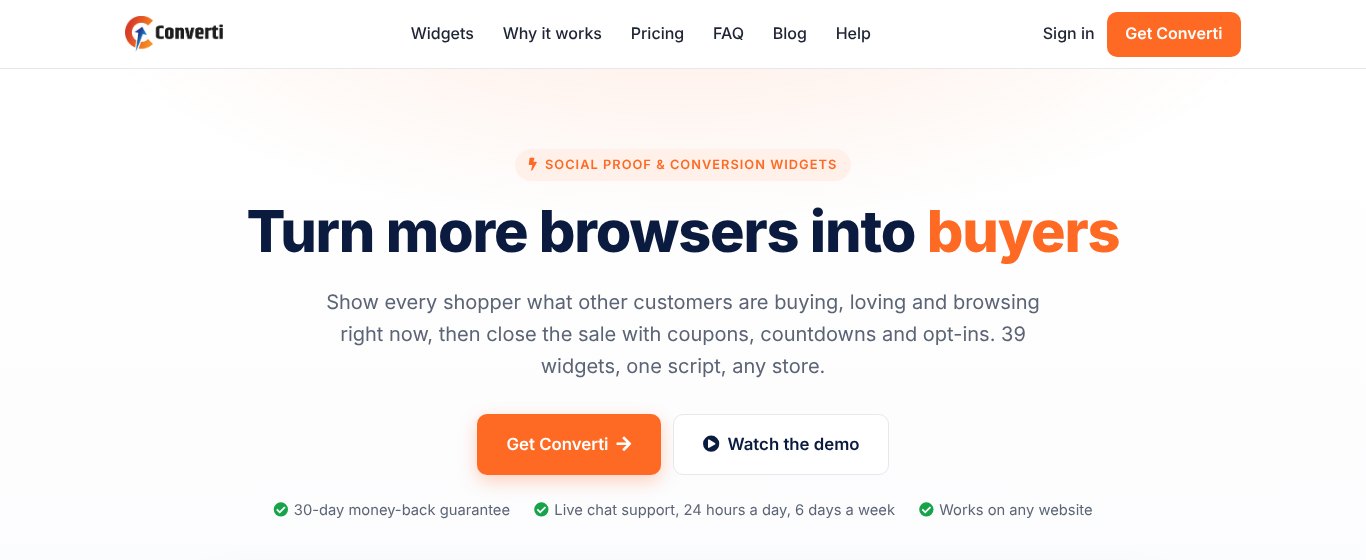
Converti lets you add signup forms and other conversion widgets to any website with one lightweight script. No coding and no stack of separate plugins.
It includes 39 widgets, and many of them are built for list building.
- Four newsletter popup styles plus modal collectors for focused signups.
- A floating newsletter form that stays on screen and gives visitors a quick way to subscribe.
- An email collector bar that captures emails without pulling attention from your main message.
- Countdown collectors that pair a signup with a deadline offer.
- Phone number collectors for callbacks and sales calls.
- Social proof widgets like recent sales, live visitor counts and Google reviews that build trust near your forms.
You pick a widget, match it to your brand, choose the pages it appears on, and publish. Widgets load in the background so your pages stay fast, and they look right on phones, tablets and desktops.
The Elite plan costs $5.58 a month, paid yearly ($67 a year), and covers one website with 10 widgets and 8,000 widget views a month. Pro is $97 a year for 5 websites and unlimited widgets. Both come with a 30 day money-back guarantee.
Comparing options? See our list of the best email collection tools for more ways to grow your list.
Common Signup Form Mistakes
- A vague headline. "Newsletter" is not a reason to subscribe.
- Too many fields. Name, email, company and phone scare most people away.
- Instant popups. Showing a popup before anyone has read a word.
- No follow-up. Collecting emails and then not sending anything for weeks.
- One form, hidden in the footer. Most visitors never scroll that far.
- Forgetting fake signups. Disposable emails make your list look bigger than it is.
Here's a quick video from OptinMonster on building an above the fold signup form.
How to Measure Your Signup Forms
Track a few simple numbers for each form.
- Conversion rate. Signups divided by the number of people who saw the form.
- Signups per page. Which pages bring in the most subscribers?
- Welcome email opens. A low open rate can mean fake or low quality signups.
- Unsubscribes in the first month. High numbers mean your promise didn't match what you sent.
Look at these numbers once a month, and write down any changes you made so you can connect them to the results. Put more effort into the forms and pages that work, and fix or remove the ones that don't.
FAQ
What is a good conversion rate for a newsletter signup form?
It varies a lot by site and form type. Inline forms often convert a small percent of visitors, while well-timed popups and landing pages can do much better. The best benchmark is your own past results.
Should I ask for a first name?
Only if you'll use it. A name lets you personalize emails, but every extra field lowers signups a little.
Are popups bad for my website?
Not when they're used kindly. Delay them, make them easy to close, and keep them small on phones.
How many signup forms should I have on a page?
Two or three different types usually work well, like one inline form, a sticky bar and an exit popup. More than that starts to feel pushy.
How do I keep fake emails off my list?
Use double opt-in for important lists, watch for strange signup spikes, and consider a tool that blocks disposable email addresses at the form. A clean list gets better delivery and more honest numbers.
How long should I wait before showing a popup?
A good starting point is 30 to 60 seconds, or when a visitor scrolls halfway down. Exit popups are another gentle option because they only appear when someone is about to leave.
Final Thoughts
A great newsletter signup form makes a clear promise, asks for very little and shows up at the right moment. Put forms where readers are engaged, give them a reason to join and test one change at a time.
If you want an easy way to add popups, bars and floating forms to any site, try Converti and start turning more of your visitors into subscribers.